Custom Alignments
struct MyCustomAlignment: AlignmentID {
  static func defaultValue(in context: ViewDimensions) -> CGFloat
}
Custom alignment allows you to define your own alignment guides for arranging views in a layout—going beyond built-in options like .leading, .center, .trailing, etc. It gives you precise control over how views line up relative to each other in containers like HStack, VStack, or ZStack.
Example
struct FirstThirdAlignment: AlignmentID {
static func defaultValue(in context: ViewDimensions) -> CGFloat {
context.height / 3
}
}
extension VerticalAlignment {
static let firstThirdAlignment = VerticalAlignment(FirstThirdAlignment.self)
}
@QuickLayout
final class CustomAlignmentView: UIView {
private let colorViews = (0...8).map { index in
let view = UIView()
view.backgroundColor = .systemBlue
return view
}
private let labels = (0...8).map { index in
let label = UILabel()
label.text = "\(index)"
label.textColor = .white
label.font = .monospacedDigitSystemFont(ofSize: 18, weight: .medium)
return label
}
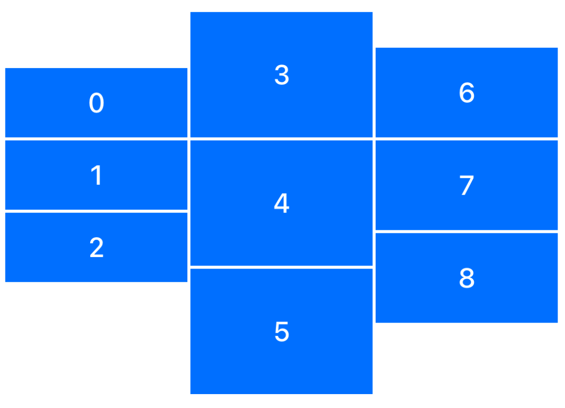
var body: Layout {
HStack(alignment: .firstThirdAlignment, spacing: 2) {
VStack(spacing: 2) {
colorViews[0].overlay { labels[0] }
colorViews[1].overlay { labels[1] }
colorViews[2].overlay { labels[2] }
}.frame(height: 140)
VStack(spacing: 2) {
colorViews[3].overlay { labels[3] }
colorViews[4].overlay { labels[4] }
colorViews[5].overlay { labels[5] }
}.frame(height: 250)
VStack(spacing: 2) {
colorViews[6].overlay { labels[6] }
colorViews[7].overlay { labels[7] }
colorViews[8].overlay { labels[8] }
}.frame(height: 180)
}
.padding(20)
}
}